Gives your page a look of its own, so it stops looking AI-made. Builds new pages too.
Deft against the best free skill we found for this job
All 6 testsout of 300
Deft240out of 300, highest
Free skill215out of 300
No skill180out of 300
A dashboardout of 50
Deft42out of 50, highest
Free skill34out of 50
No skill29out of 50
A new page from a briefout of 50
Deft42out of 50, highest
Free skill35out of 50
No skill26out of 50
A landing pageout of 50
Deft41out of 50, highest
Free skill34out of 50
No skill30out of 50
A restaurant websiteout of 50
Deft39out of 50, highest
Free skill34out of 50
No skill33out of 50
A pricing pageout of 50
Deft39out of 50, highest
Free skill38out of 50
No skill31out of 50
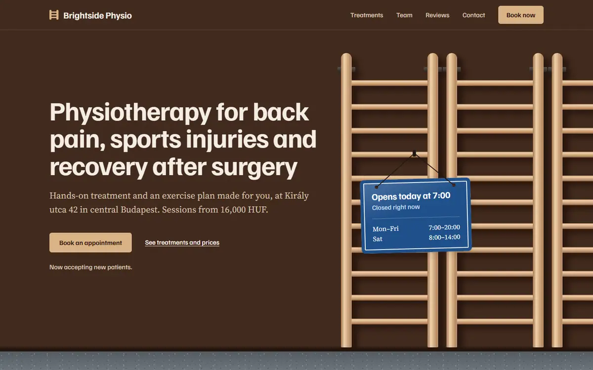
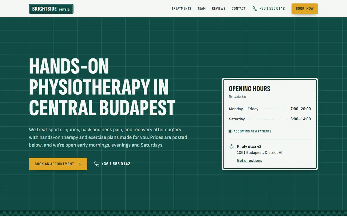
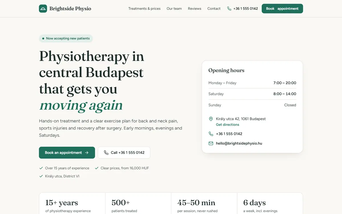
A clinic websiteout of 50
Deft37out of 50
Free skill40out of 50, highest
No skill31out of 50
Each quality, out of 10
AI look goneDeft 9 out of 10Free skill 6 out of 10No skill 4 out of 10
DesignedDeft 9 out of 10Free skill 8 out of 10No skill 5 out of 10
Honest contentDeft 8 out of 10Free skill 8 out of 10No skill 7 out of 10
Readable on phonesDeft 8 out of 10Free skill 8 out of 10No skill 8 out of 10
The replyDeft 7 out of 10Free skill 7 out of 10No skill 7 out of 10
See the work and how we tested
How we tested
Each test sent the same request three ways: with Deft, with the best free skill we found for this job, and with no skill at all.
The judges were AI agents, not people. They saw the three results as A, B and C with every skill name removed, and scored five qualities out of 10 each, 50 in all.
The quality scores at the top are averaged over the tests and rounded.
How we picked the free skill: rated the strongest of the six free design skills we studied, and run at full strength, with its own page checker installed.
The businesses are made up. Each result is that version’s own work, unedited, from the request shown.
The work
A dashboard
The request
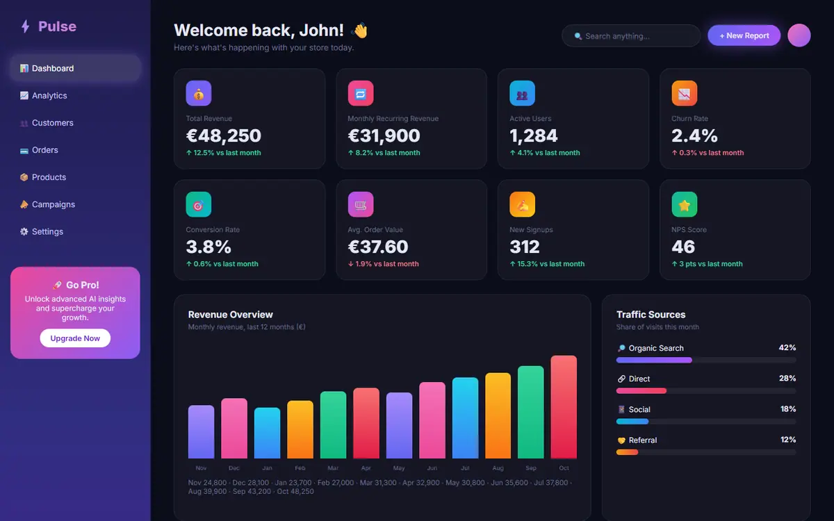
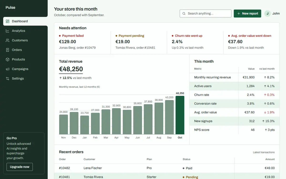
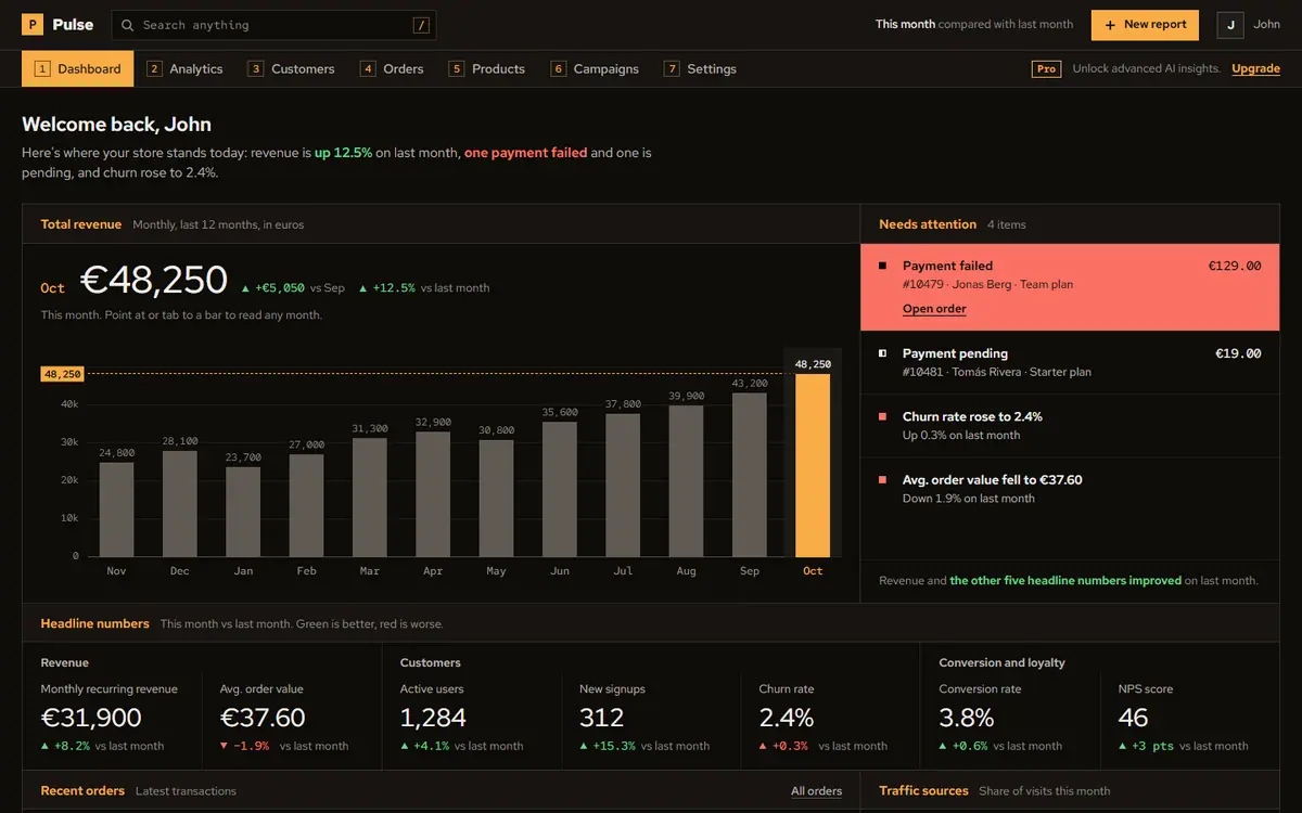
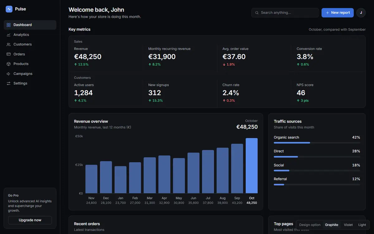
This is the main dashboard of my analytics app, Pulse. My users say it's confusing and looks cheap. Can you redesign it? Keep all the data on it.
Before
Deft
Free skill
No skill
The blind judge’s reasons
Deft was the only one with its own calm look, and it opens with what needs attention. The free skill was best at surfacing problems, but its dark terminal style is a newer AI default. The no-skill version was tidy, but still a generic dark template with eight equal tiles.
The judge’s scores, out of 10 each
Quality
Deft
Free skill
No skill
Designed
9
7
5
AI look gone
9
4
5
Honest content
9
8
7
Readable on phones
8
8
6
The reply
7
7
6
Total
42
34
29
A new page from a brief
The request
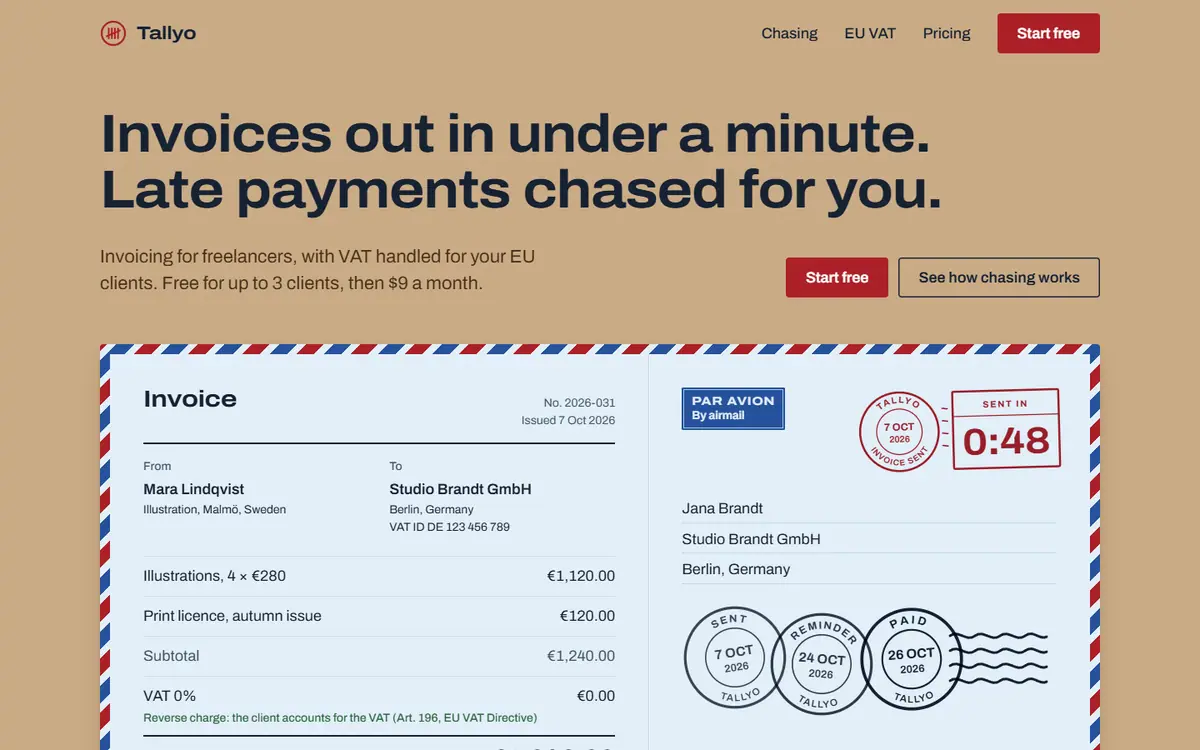
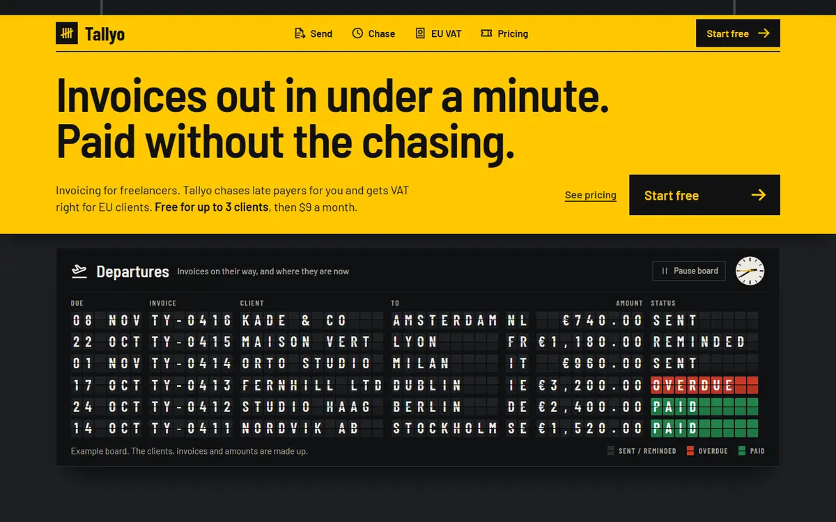
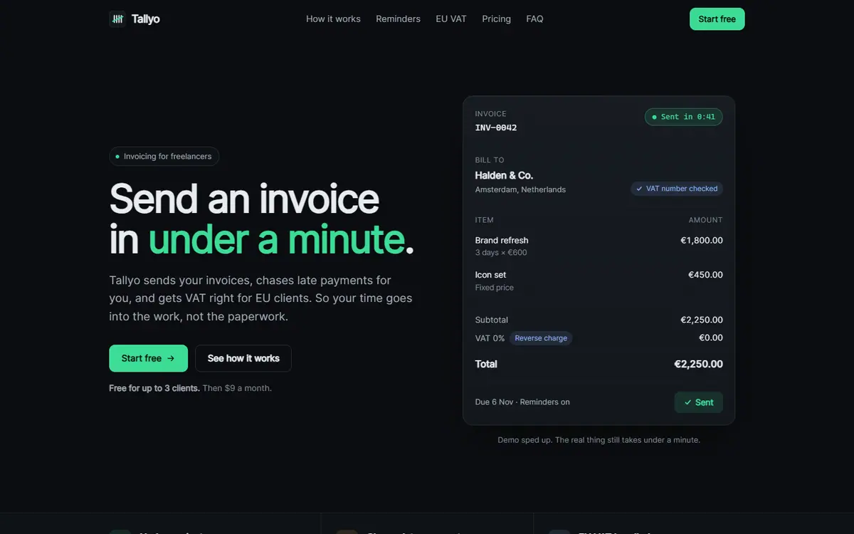
Make me a landing page for my app Tallyo. It's invoicing for freelancers: you can send an invoice in under a minute, it chases late payments for you automatically, and it handles VAT for EU clients. Free for up to 3 clients, then $9 a month. Put it in a single index.html file, no frameworks.
Deft
Free skill
No skill
Built from a short brief, so there is no before.
The blind judge’s reasons
Deft came first: one idea, a 1970s airmail counter, runs the whole page, and every object explains a feature. The free skill had a bold departures-board idea, but its dark page with one yellow accent drifts toward a common AI look. The no-skill version was a well-built but stock dark page, and it stated product facts nobody gave it.
The judge’s scores, out of 10 each
Quality
Deft
Free skill
No skill
Designed
9
8
4
AI look gone
9
6
2
Honest content
9
8
6
Readable on phones
8
7
7
The reply
7
6
7
Total
42
35
26
A landing page
The request
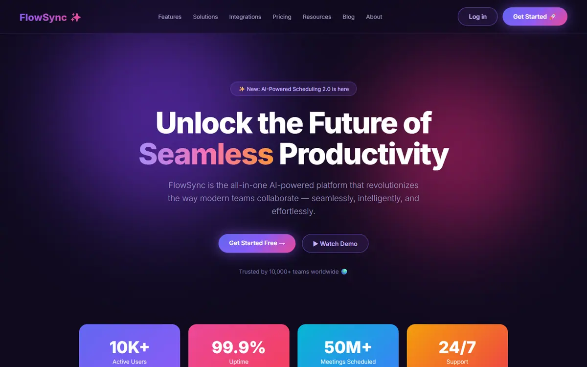
This is the landing page for my scheduling app FlowSync. A friend told me it looks like every other AI-made site and honestly I see it, but I don't know what to change. Can you fix the design so it looks like a real product? Don't lose any of the info on it.
Before
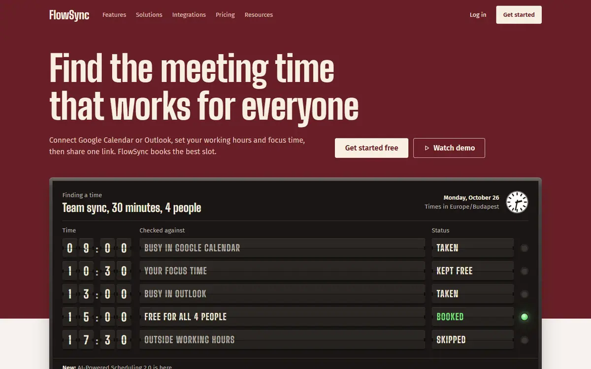
Deft
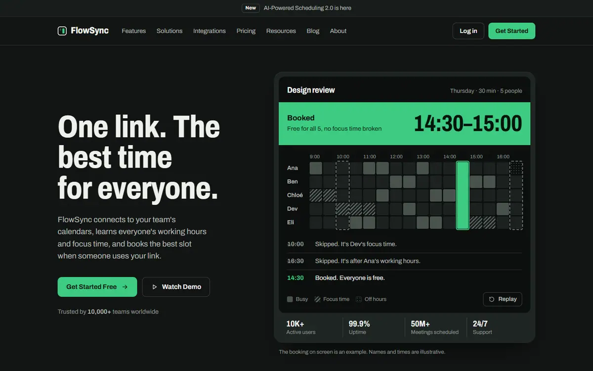
Free skill
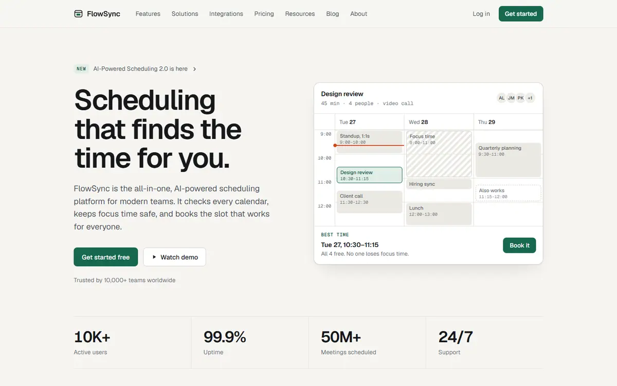
No skill
The blind judge’s reasons
Deft was the only one with a true identity of its own: a split-flap departures board that shows the app booking a slot, with honest handling of the reviews and stats. Its weak spot was a reply far too long for a non-designer. The free skill felt like a real product but landed on a common dark-and-green look and made the doubtful reviews more prominent, and the no-skill version was a clean but stock template.
The judge’s scores, out of 10 each
Quality
Deft
Free skill
No skill
Designed
9
8
5
AI look gone
9
6
3
Honest content
9
6
7
Readable on phones
8
8
7
The reply
6
6
8
Total
41
34
30
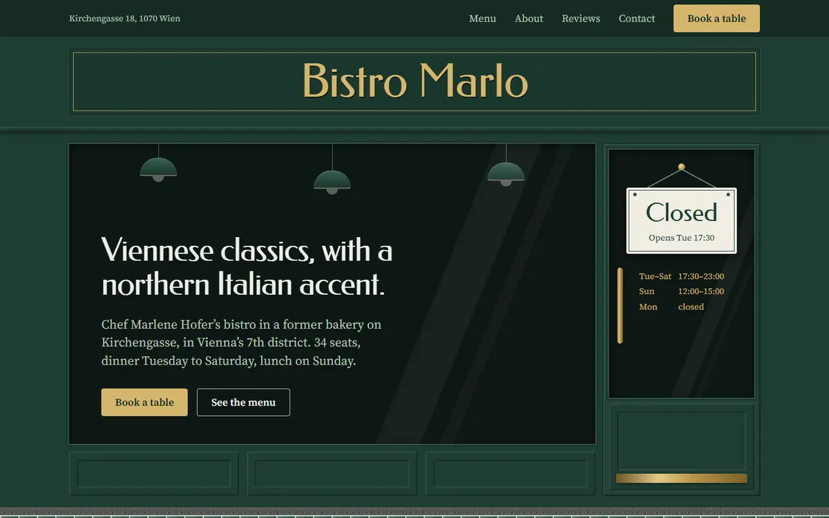
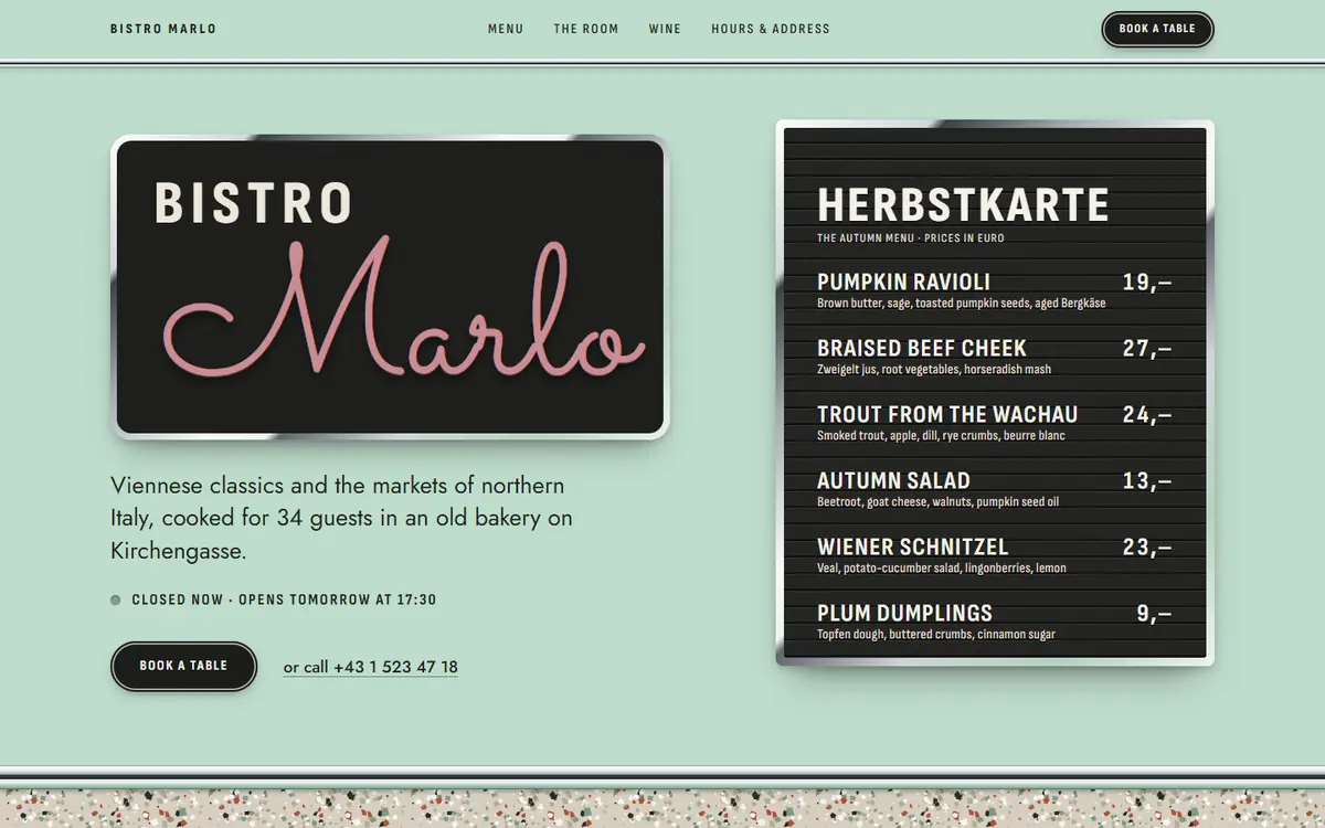
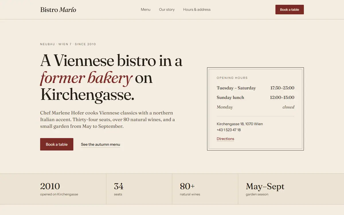
A restaurant website
The request
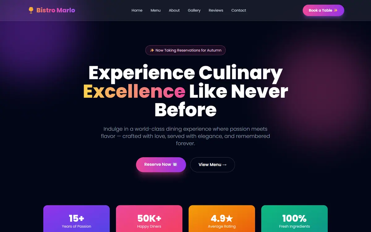
This is my restaurant's website, Bistro Marlo in Vienna. I made it with Lovable and it's in Tailwind. It looks like a template, not like a real restaurant. Can you make it look like us? Keep it in Tailwind, please.
Before
Deft
Free skill
No skill
The blind judge’s reasons
Deft was the only one that looks like this bistro and no other: a Viennese bakery shopfront, with every fact kept. Its weak spot: the made-up reviews and numbers stay on the page, only set quieter. The free skill was bold and well made but invented a 1950s espresso-bar theme, and the no-skill version swapped the old template for a newer one.
The judge’s scores, out of 10 each
Quality
Deft
Free skill
No skill
Designed
9
8
4
AI look gone
8
5
3
Honest content
7
7
9
Readable on phones
8
7
9
The reply
7
7
8
Total
39
34
33
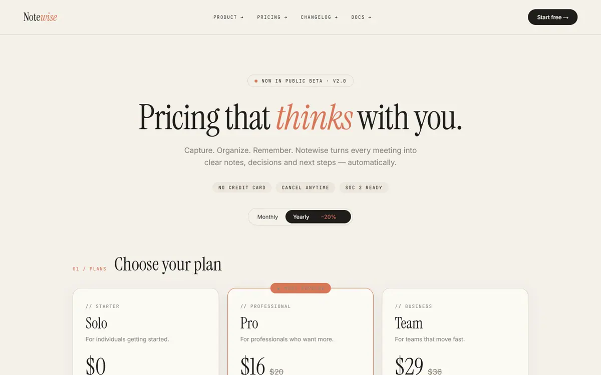
A pricing page
The request
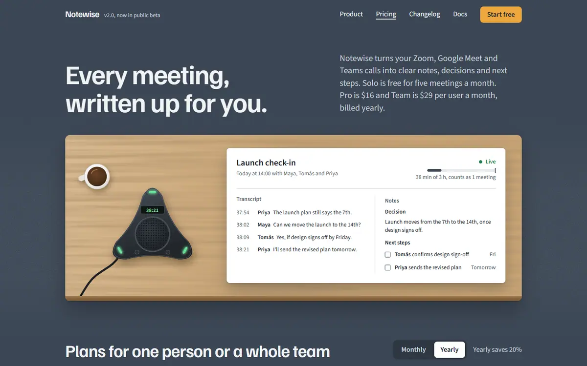
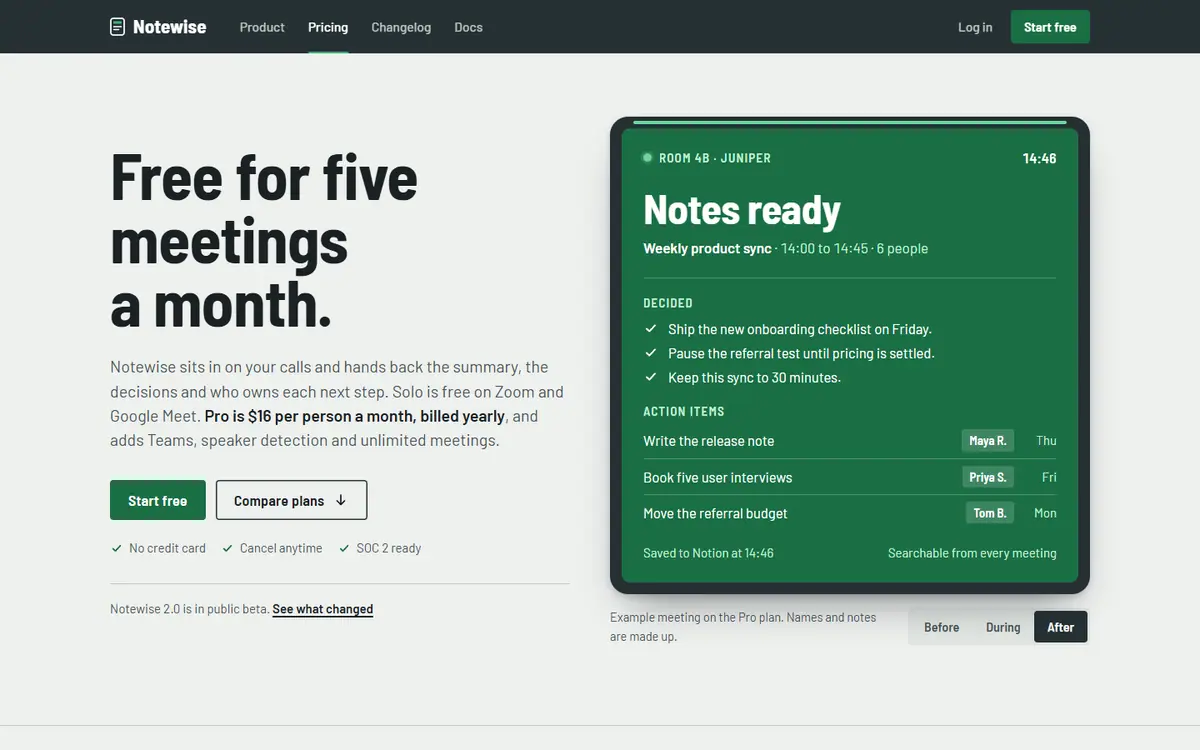
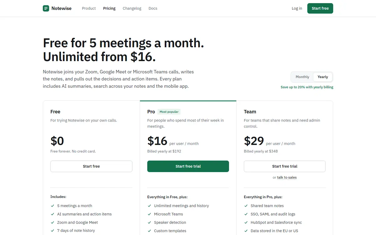
Can you redesign my pricing page? It's for Notewise, my AI meeting notes app. I already got rid of the purple look everyone hates, but people still tell me it looks AI-generated. I want it to feel like a real company made it.
Before
Deft
Free skill
No skill
The blind judge’s reasons
Deft had the most identity, a meeting room built from real materials, and was the only one to pass all 13 checks, though its reply was long and full of jargon. The free skill was a coherent office-signage look that lost narrowly on small leftovers. The no-skill version was clean and readable, but looked like a stock pricing page and changed content nobody asked about.
The judge’s scores, out of 10 each
Quality
Deft
Free skill
No skill
Designed
9
8
5
AI look gone
8
7
7
Honest content
8
8
4
Readable on phones
8
8
8
The reply
6
7
7
Total
39
38
31
A clinic website
The request
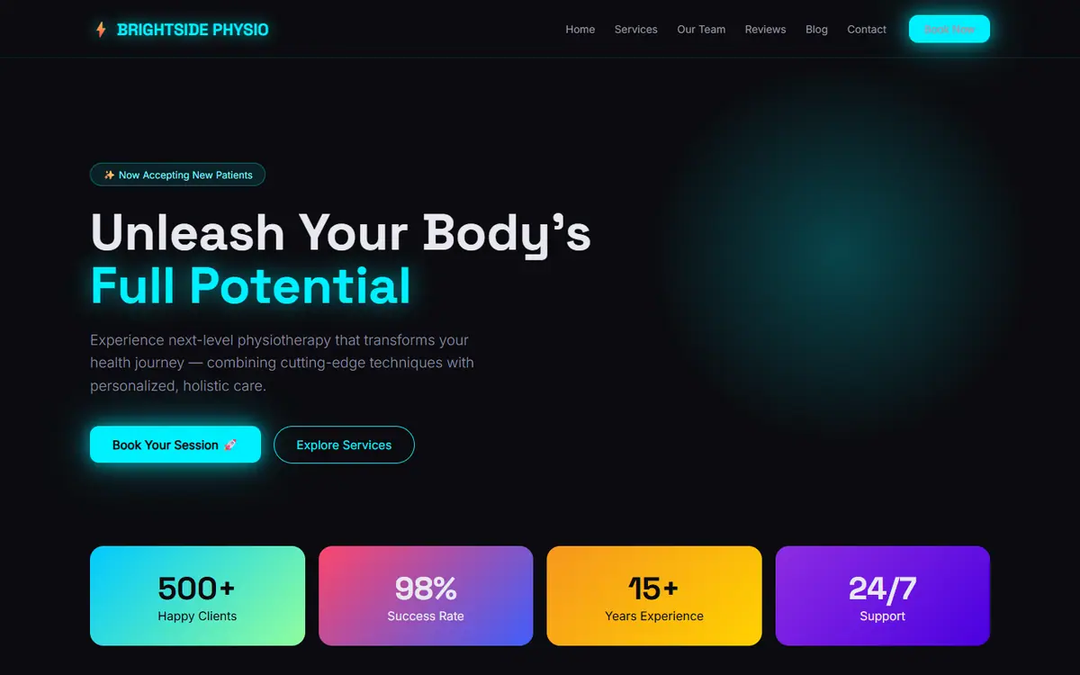
Here's the website for my physio clinic in Budapest. I made it with AI. I want it to look more professional and trustworthy so people actually book an appointment. Can you improve the design?
Before
Deft
Free skill
No skill
The blind judge’s reasons
The free skill came first: a clear Budapest look on a tight system, with the doubtful claims removed and a booking form that works. Deft had the most original idea, but its form still sent nothing, "98% success rate" stayed on the page and its reply was long. The no-skill version was the most readable, but swapped the old AI look for the newer one.